
TL;DR

Get coffee and tea gear delivered free with Prime
- Fast, free delivery on millions of items
- Prime Video, Amazon Music and more included
- Member-only deals all year
Ina Garten recommends choosing a small color palette for displayed kitchen pieces, citing white china and silver as one example. Good Housekeeping reports that the approach can work with items people already own; Garten also suggests mixing shapes, heights and old and new pieces.
Ina Garten recommends choosing a small color palette for kitchen displays, with white china and silver as one example, according to a tip from her Substack highlighted by Good Housekeeping. The advice offers homeowners a way to make visible dishes and serving pieces feel more coordinated without replacing cabinetry or buying a matching set.
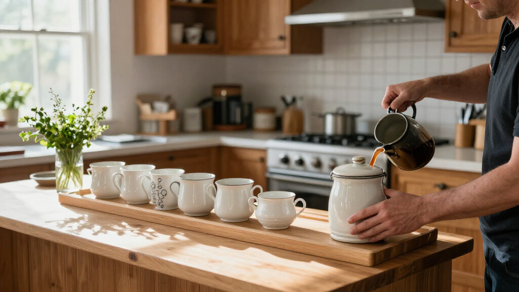
Garten’s suggestion is to pick a limited combination of colors and use it across pieces kept on display. Good Housekeeping reports that the example she gave was white china and silver. The publication describes the idea as adaptable: people can use another combination that suits their own kitchens and the items they already have.
The report also cites Garten’s advice to make displays varied in form. She recommends pairing old and new pieces and placing different shapes and heights together, rather than arranging only round bowls or flat plates. Good Housekeeping says platters can be leaned against a wall, while a stack of cookbooks or a wireless table lamp can add height to a display.
Open shelving and glass-fronted cabinets are among the ways to show dishes and trays, the report says. Garten’s broader point is that display items can be things people actually use and enjoy, rather than objects bought only to decorate. The suggested changes are arrangement choices; the report does not call for a kitchen renovation or prescribe a particular budget.
A Cohesive Look Without New Cabinets
The tip matters to readers because it focuses on a visible part of the kitchen that can often be changed with existing dishes and serving pieces. A limited palette gives pieces of different ages or styles a shared visual thread, while varied shapes and heights keep the arrangement from looking uniform. That is a practical alternative to replacing serviceware simply to make it match.
The approach is also flexible rather than a strict decorating formula. Garten’s white-and-silver example is one option, not a requirement; households can choose colors that fit their kitchens. The report does not claim that this arrangement will change how a kitchen functions or increase a home’s value. Its stated appeal is a more considered display using items the owner already likes.
Products Worth Considering

Instant Pot Pro Plus 6 Qt 10-in-1 Electric Pressure Cooker, Black

Vitamix Propel Series 750 Professional-Grade Blender, 4 Programs, Black

Ninja PossibleCooker PRO Plus 11-in-1 8.5 qt Trace Blue (MC2002BL)
As an affiliate, we earn on qualifying purchases.
Garten’s Display Advice in Practice
The Good Housekeeping article presents the tip as part of Garten’s wider home and cooking advice shared through her Substack. It notes that her Instagram images have included pale cookware and bowls alongside silver serving pieces, though that observation is the publication’s, not a separate statement from Garten about a formal design plan.
The report frames white and silver as a lasting combination that can sit comfortably alongside changing trends. It also points out that a collection does not have to match exactly: different materials, shapes and undertones can create a collected look when the overall colors remain restrained. The practical suggestion is to arrange visible pieces deliberately, not to pursue a perfectly uniform set.
Details the Report Does Not Establish
The source does not identify the date of Garten’s original Substack post, explain whether the advice was prompted by a particular project, or provide further details about where or when she first used the display idea. It also does not report any measured effect on how people perceive or use their kitchens.
The recommendation is presented as Garten’s personal design advice, not as a tested method with guaranteed results. Whether a small palette feels cohesive will depend on the pieces, finishes and colors in each room. Good Housekeeping offers examples, but no prescribed palette beyond Garten’s white-and-silver suggestion.
How Readers Can Apply the Tip
No product launch, event or follow-up announcement is described in the source. Readers can apply the advice by selecting a few colors from pieces they already own, then grouping displayed dishes and trays while varying their shapes and heights. Open shelves or glass-front cabinets can make the arrangement visible, but the tip does not require either.
The next step is personal rather than a scheduled news development: homeowners can adjust the display over time, combining useful pieces with items they enjoy seeing. The source provides no further timeline or additional Garten announcement tied to this decorating advice.
Key Questions
What is Ina Garten’s kitchen decorating tip?
Garten recommends choosing a small color palette for displayed kitchen items. The example cited by Good Housekeeping is white china and silver.
Do I need to buy a new set of dishes?
No. The report presents the tip as something people can adapt using pieces they already own. Its emphasis is on arranging items in a limited palette, not replacing cabinets or buying a matching set.
How can a display look varied without feeling chaotic?
Garten suggests putting different shapes and heights together and mixing old and new pieces. A platter, a stack of cookbooks or a lamp can add height, according to the report.
Does Garten say white and silver are the only colors to use?
No. White china and silver are her cited example. Good Housekeeping says the idea can be adapted to another simple color combination that suits a reader’s style.
Source: goodhousekeeping.com